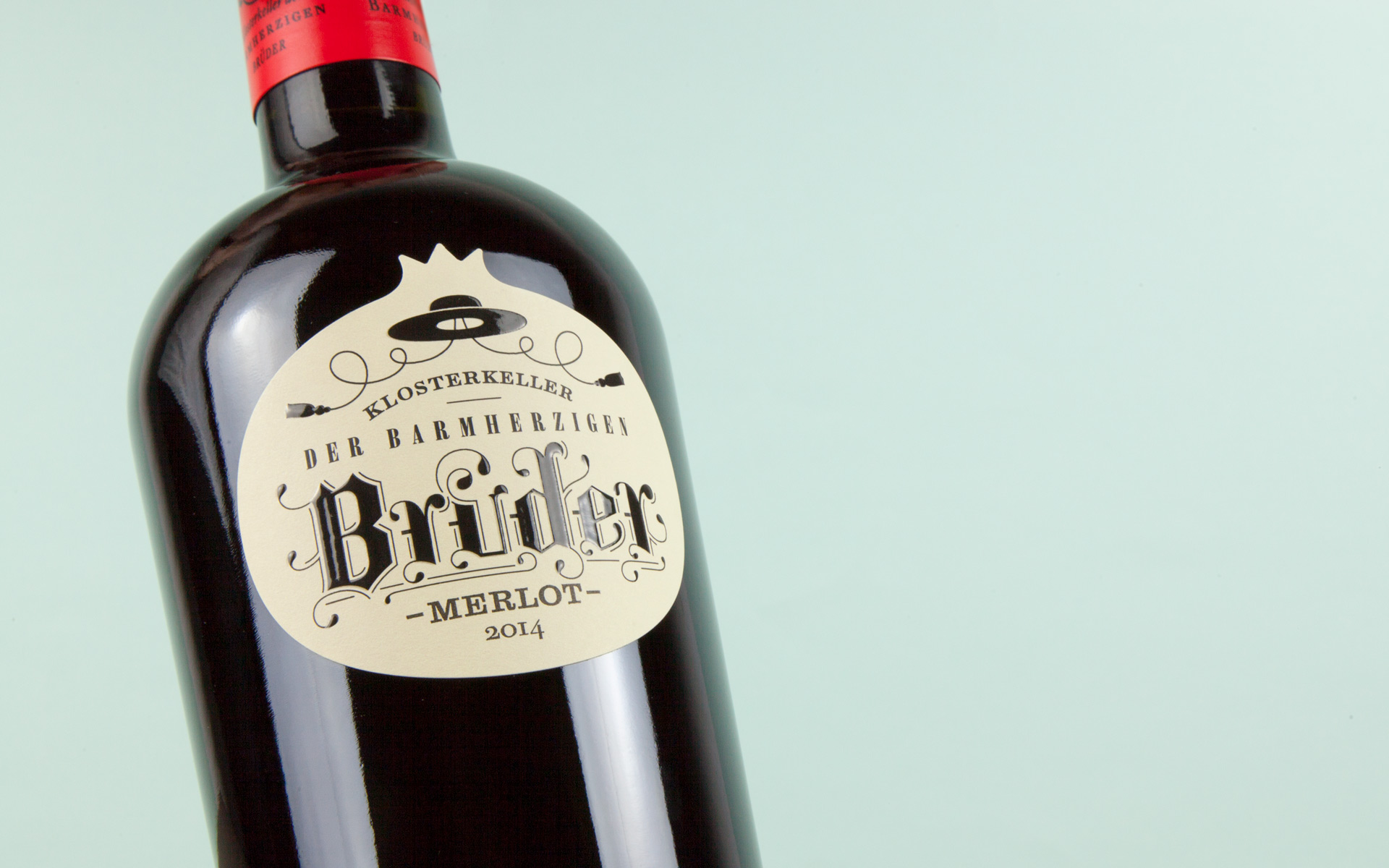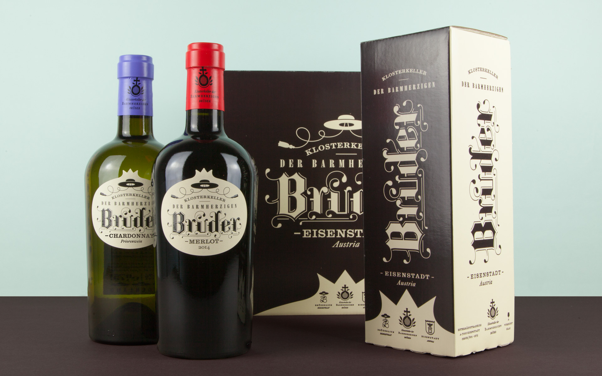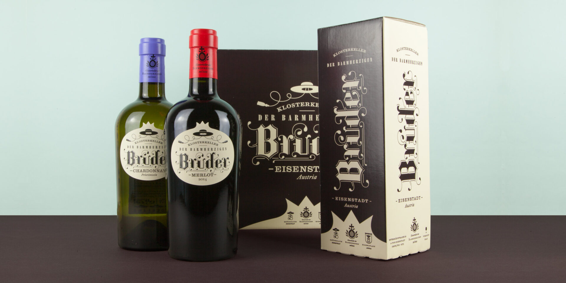
At the start of this project for the Brothers of Mercy, we immediately retreated to the monastery, where, within its ancient walls, we kept coming across two things: old books and the symbol of the pomegranate. Reason enough to use this unique combination for the packaging design of the monastery’s own wine. Old-style lettering and the shape of the pomegranate as the central theme feature on the labels as well as on the cardboard boxes. So be it.
Design & Concept: Alessandri Design