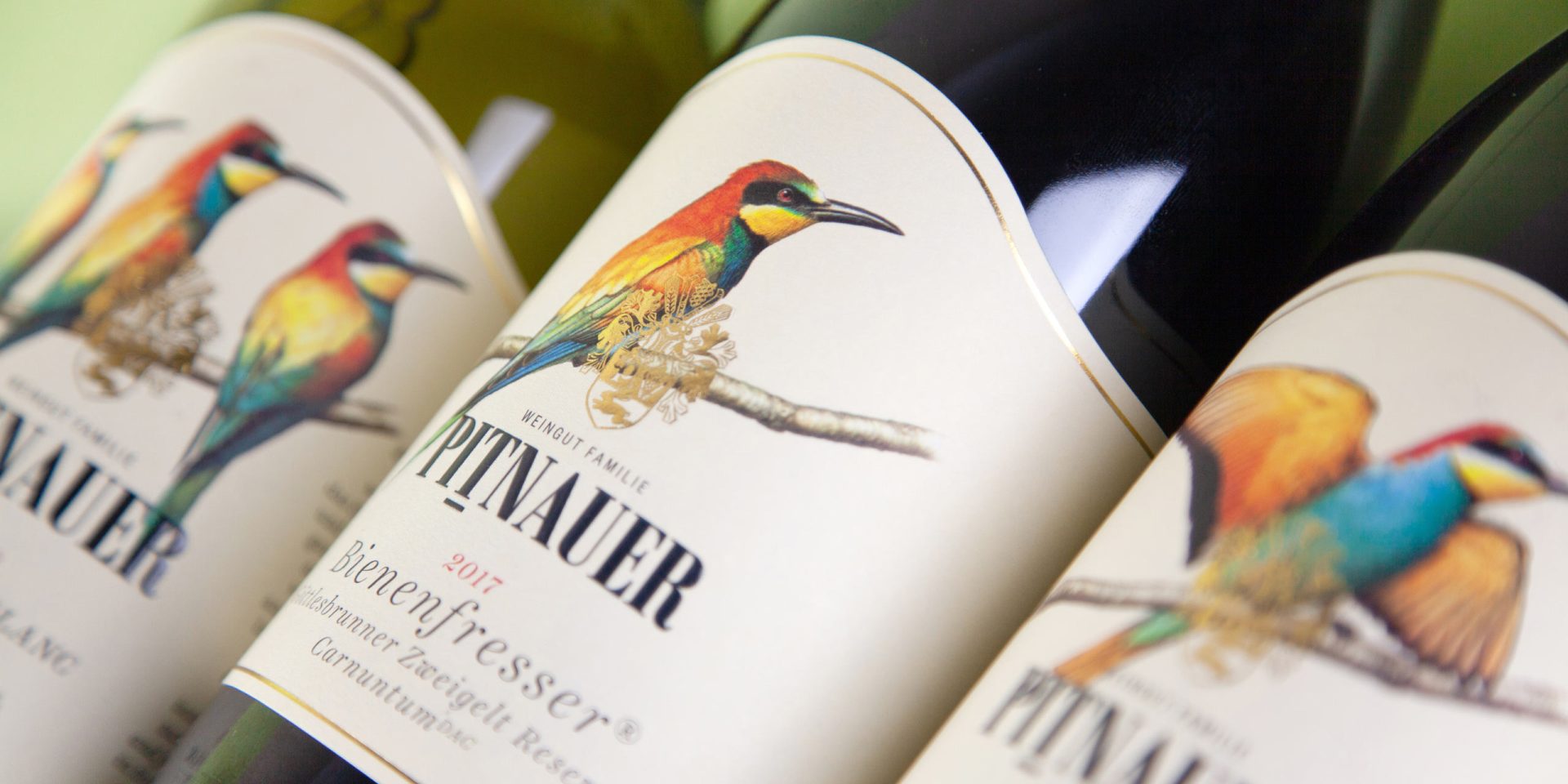
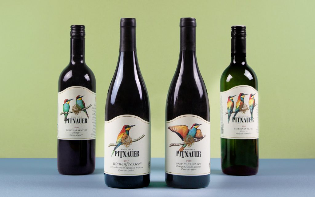
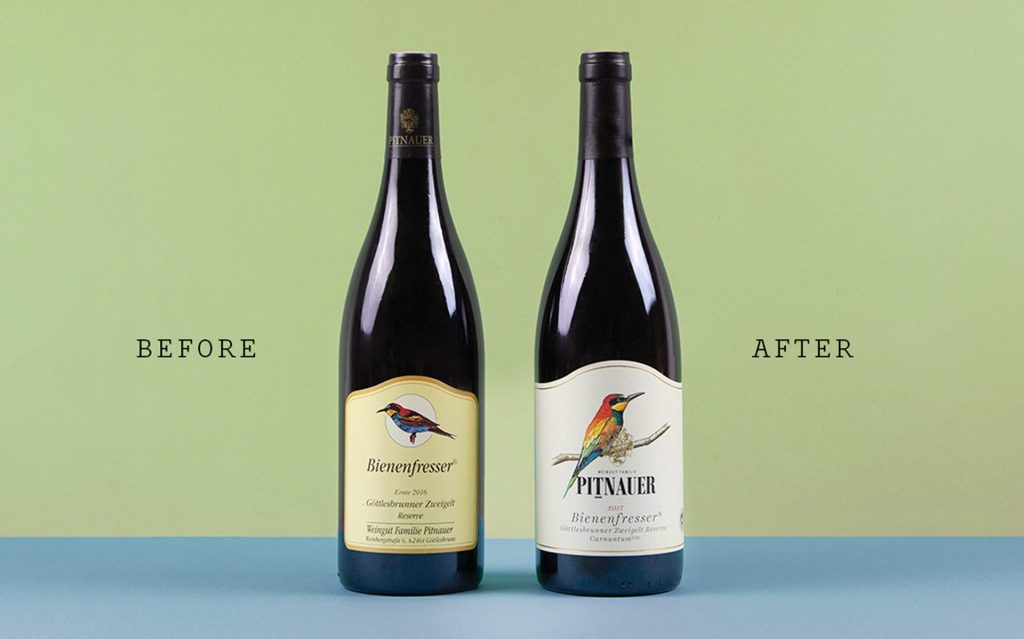
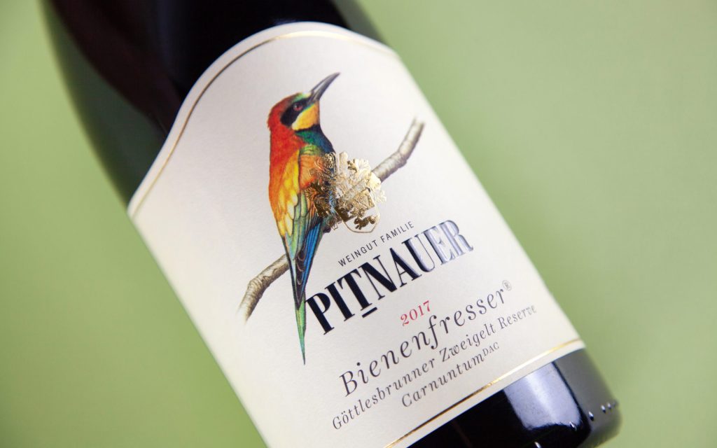
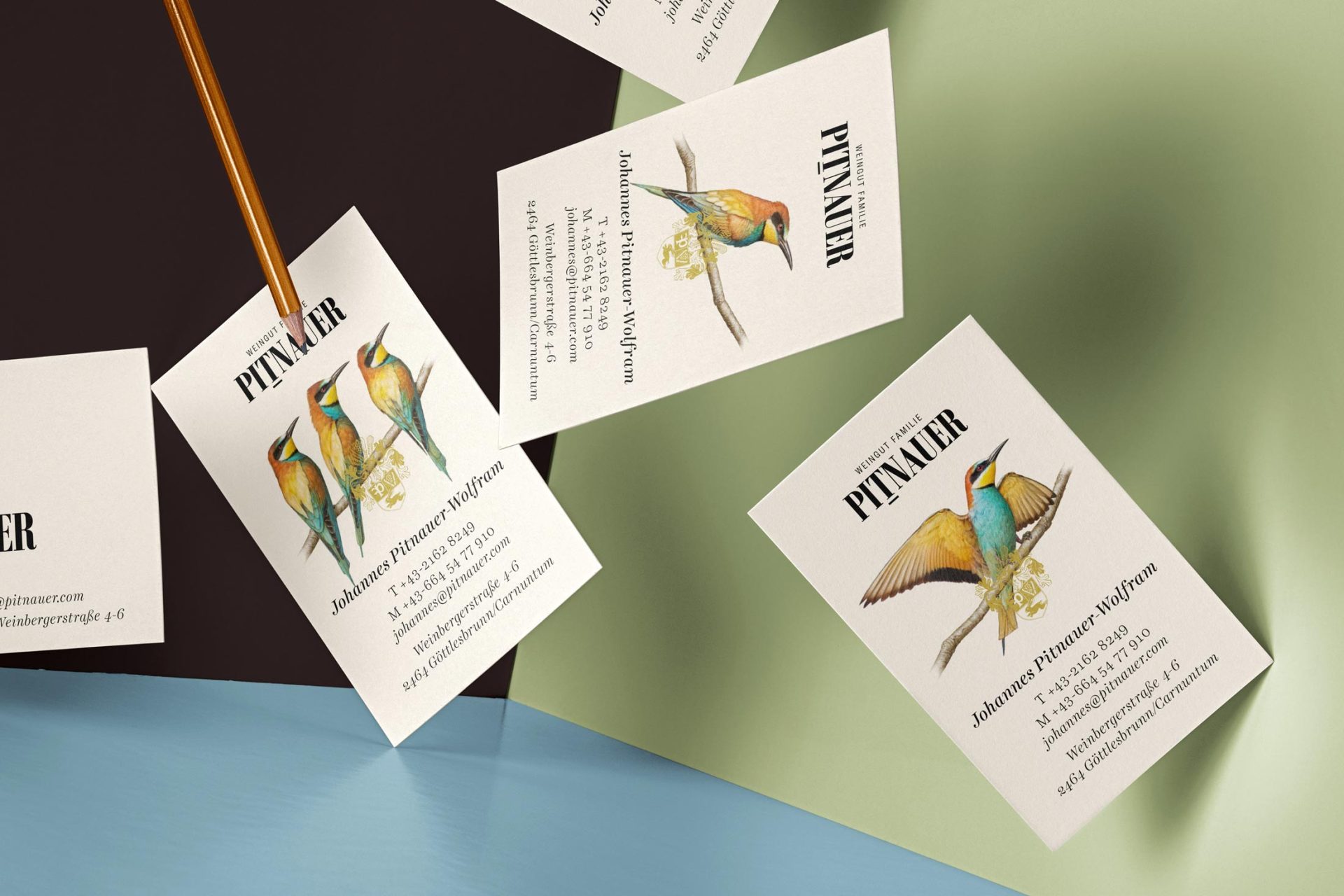
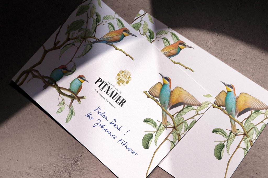
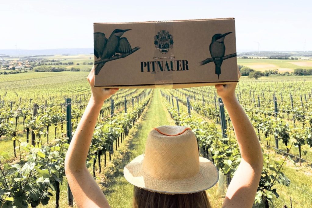
One thing can be said with good reason: since the very early nineties, the name Pitnauer has stood for some of the finest wines from the Carnuntum region. It’s no wonder that, with so much quality over the decades, many—indeed, too many—design elements have accumulated. We have, so to speak, had a bit of a clear-out and focused on one thing: Merops apiaster, better known as the bee-eater, a unique and beautiful bird native to the area. The birds have been made more striking, whilst the label’s distinctive curve has been retained as a trademark. The result is ultimately a sort of quality pyramid featuring one, two or three of these colourful creatures.
Design & Concept: Alessandri Design, Illustrations (Birds): Fritz Dorfner


 Like on: