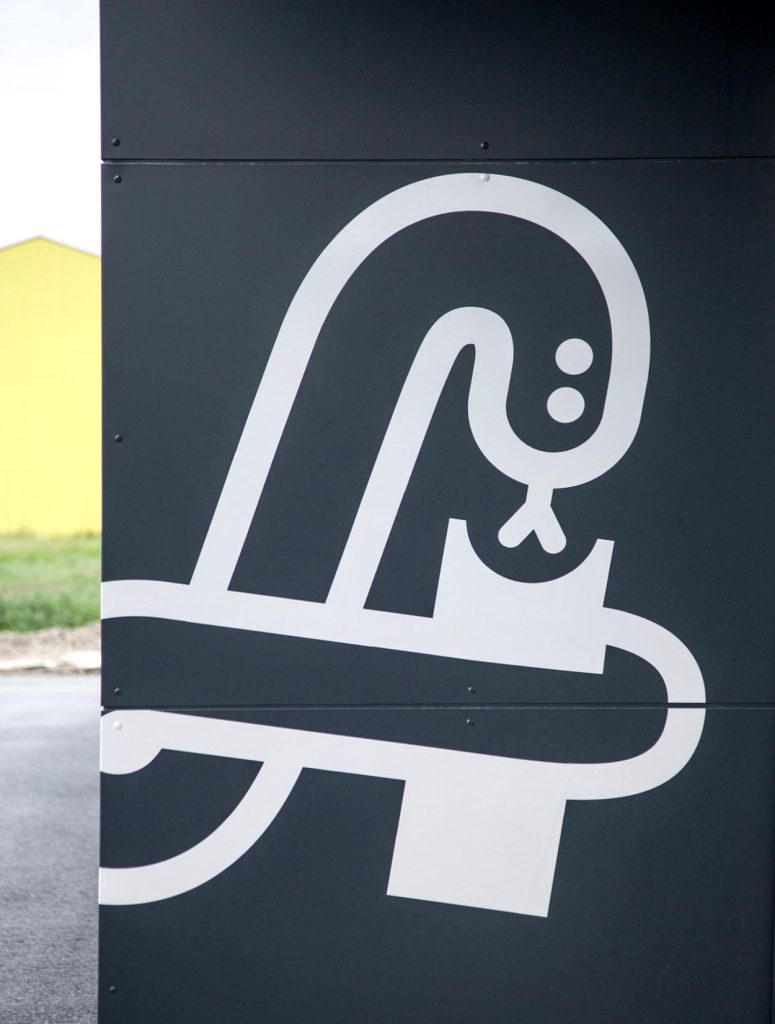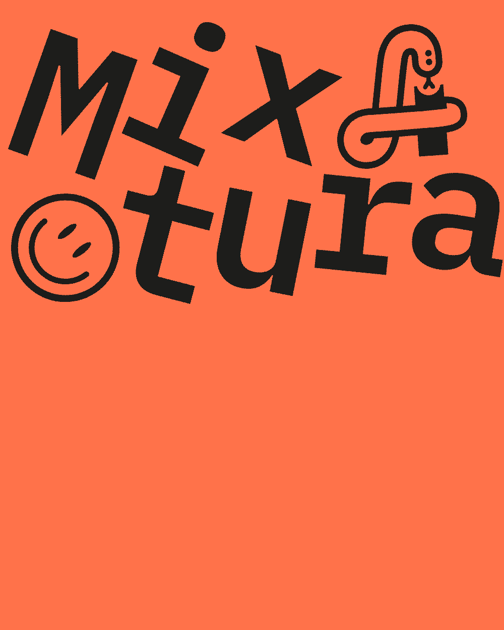
Next-level alphabet soup
Anyone who frequently finds themselves in dire need of a solution to poor design would do well to come to us. We have a range of approaches we can use to help in an emergency.
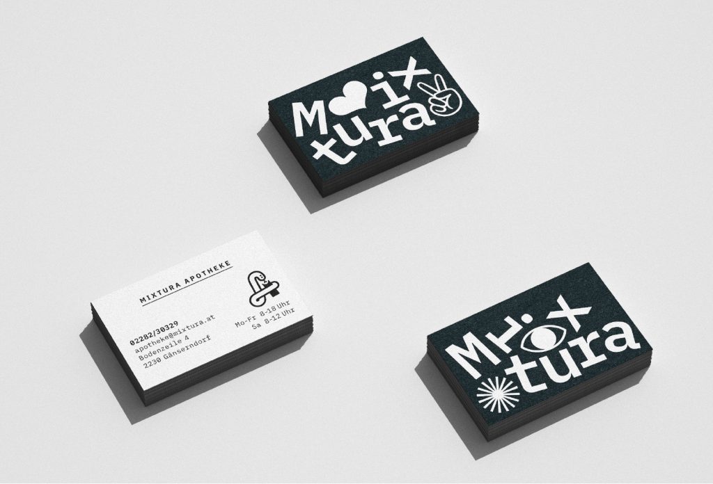
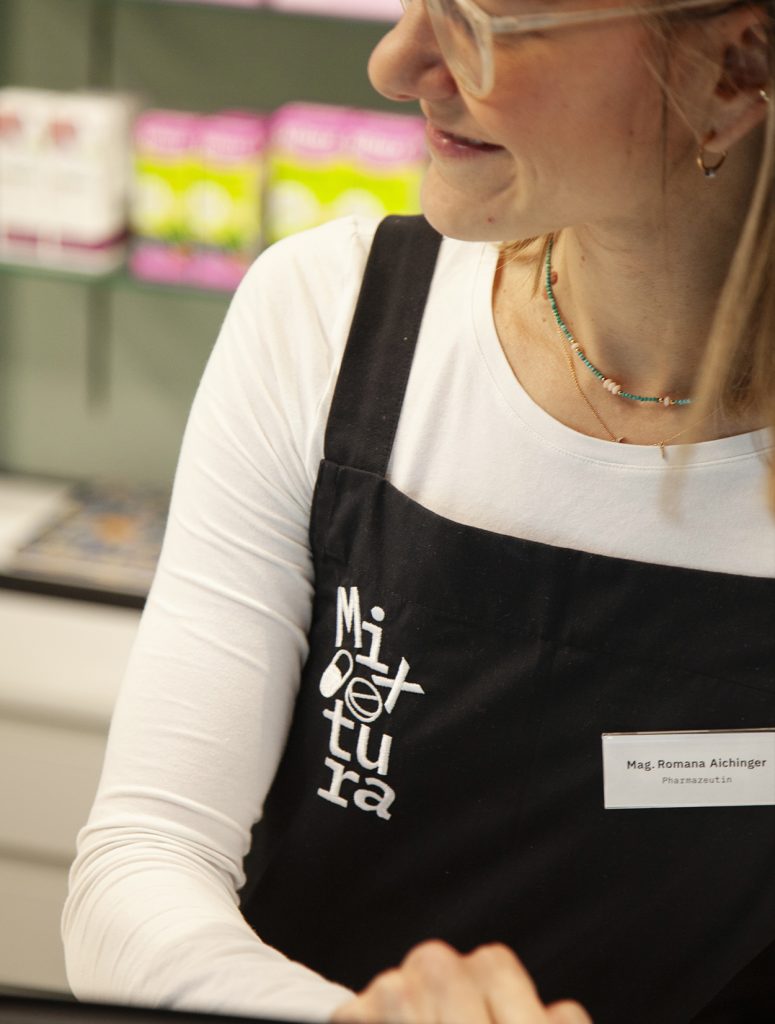
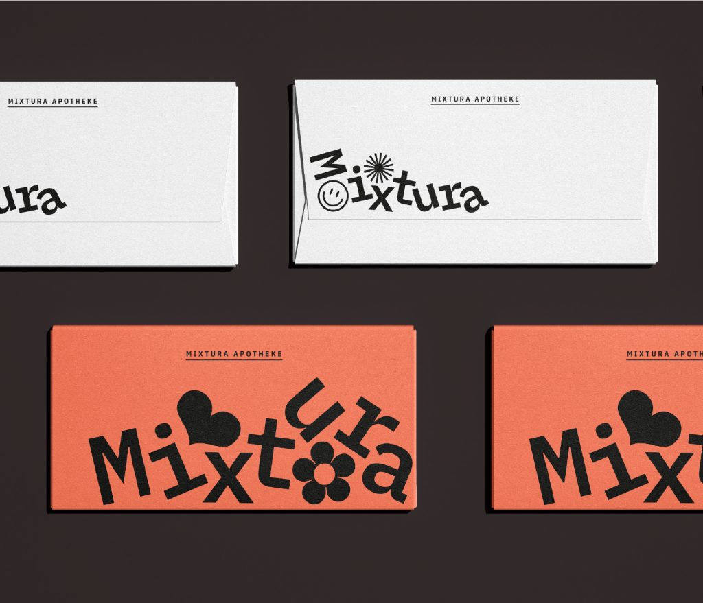
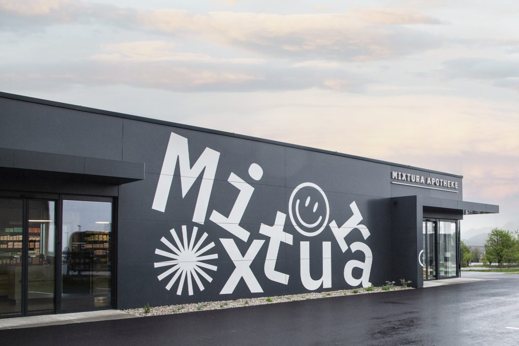
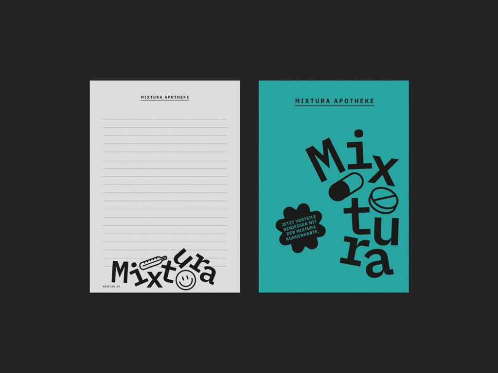
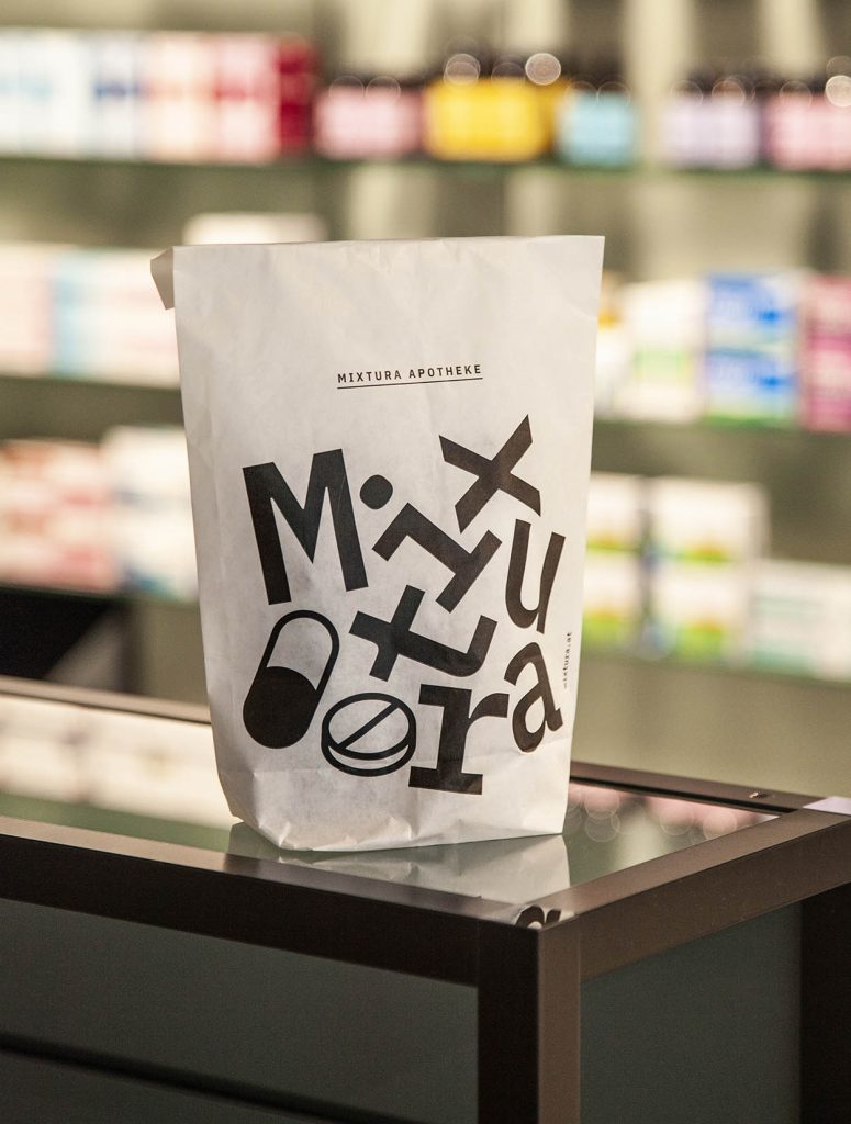
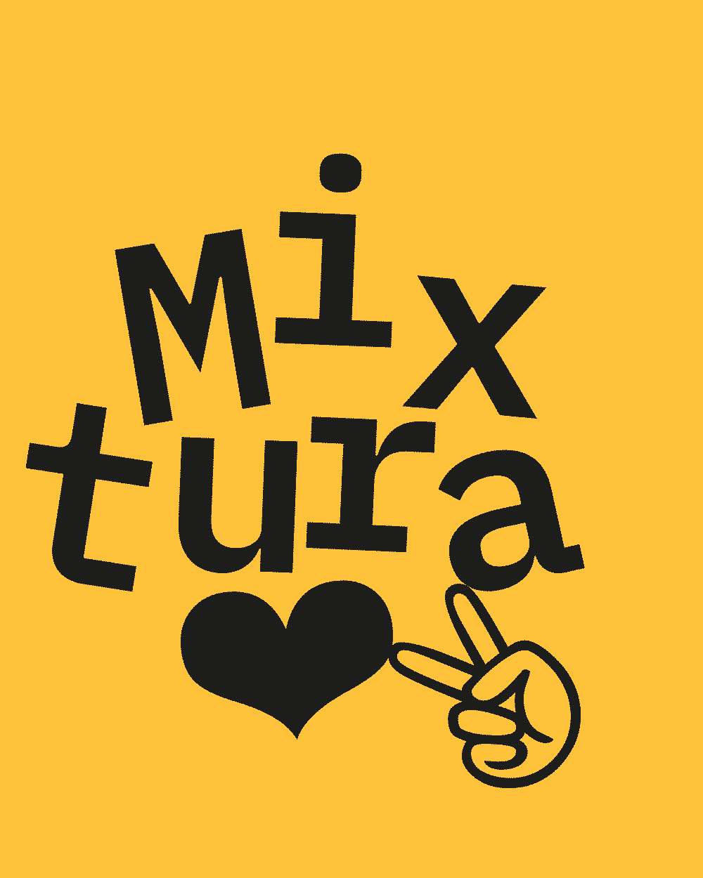
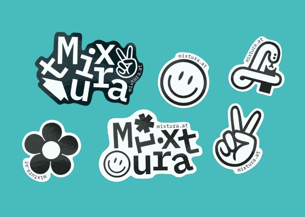
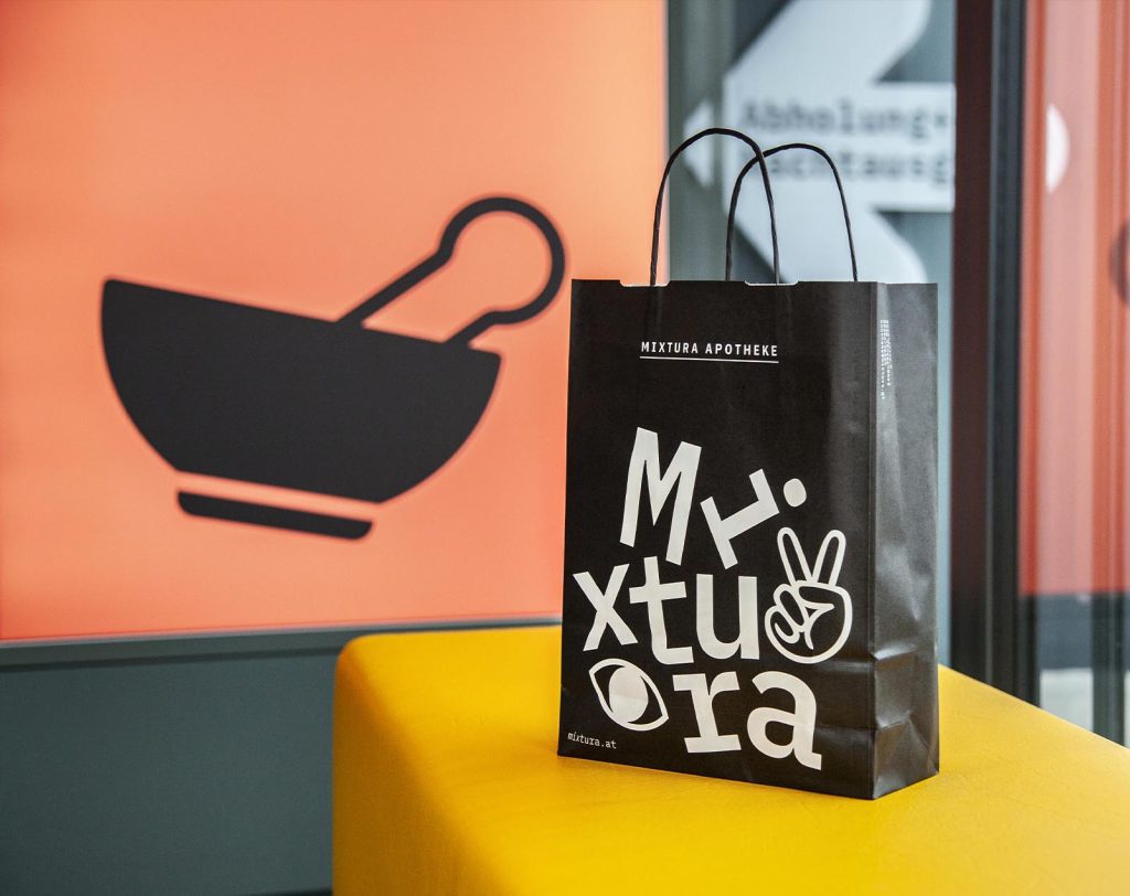
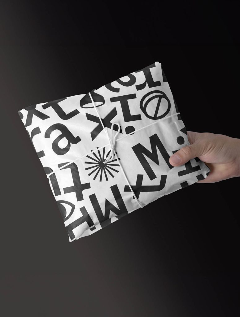
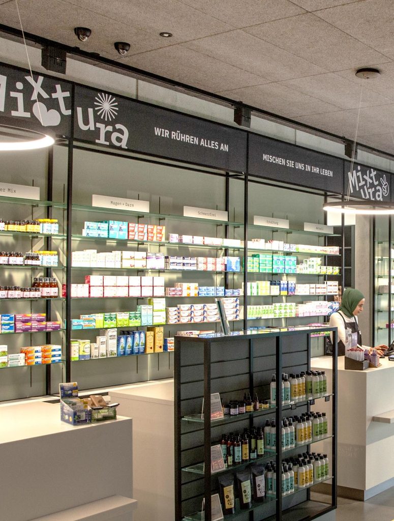
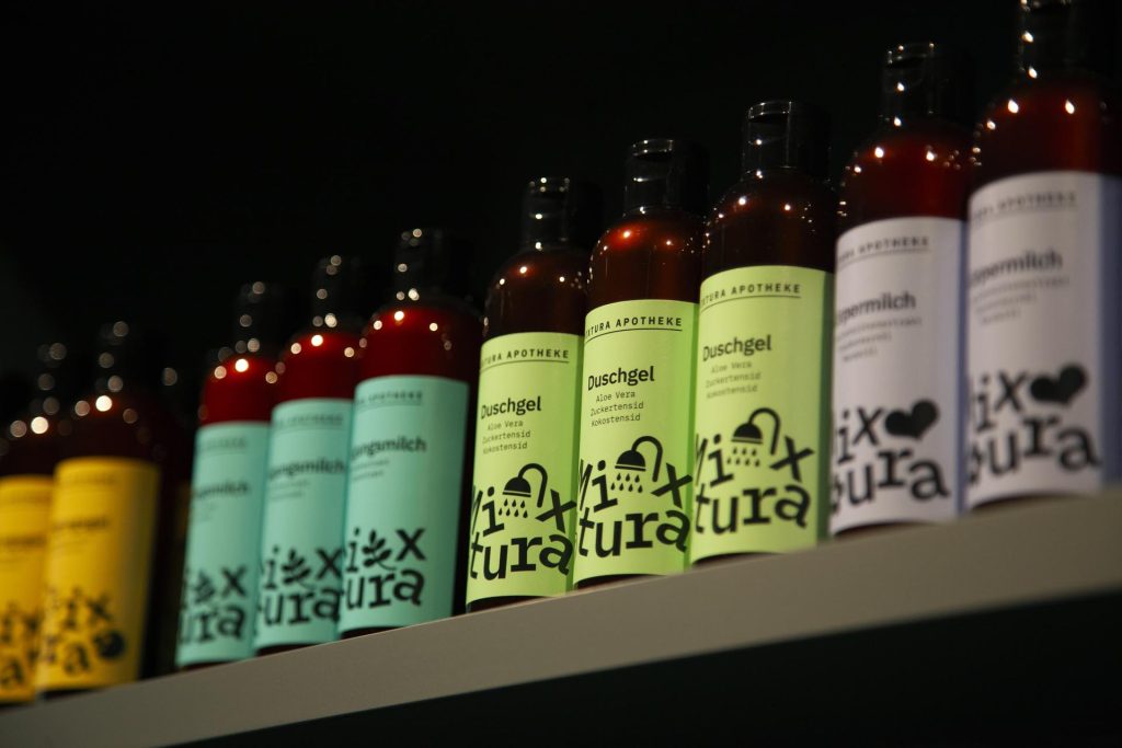
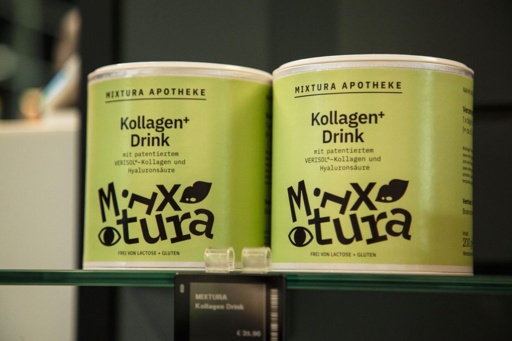
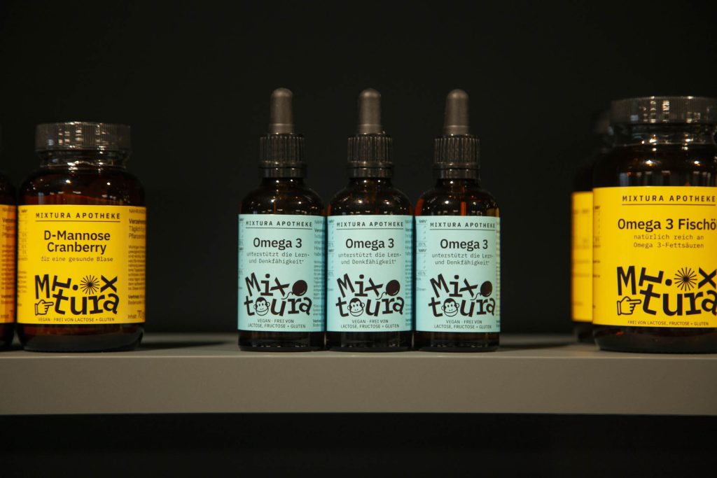
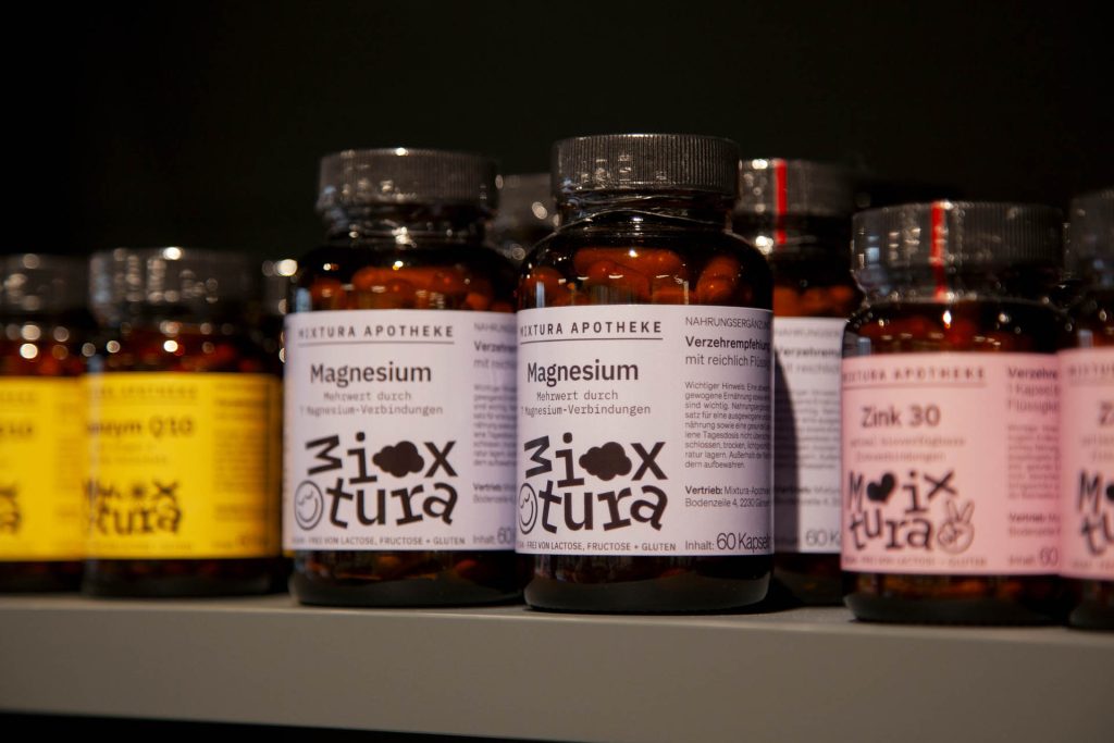
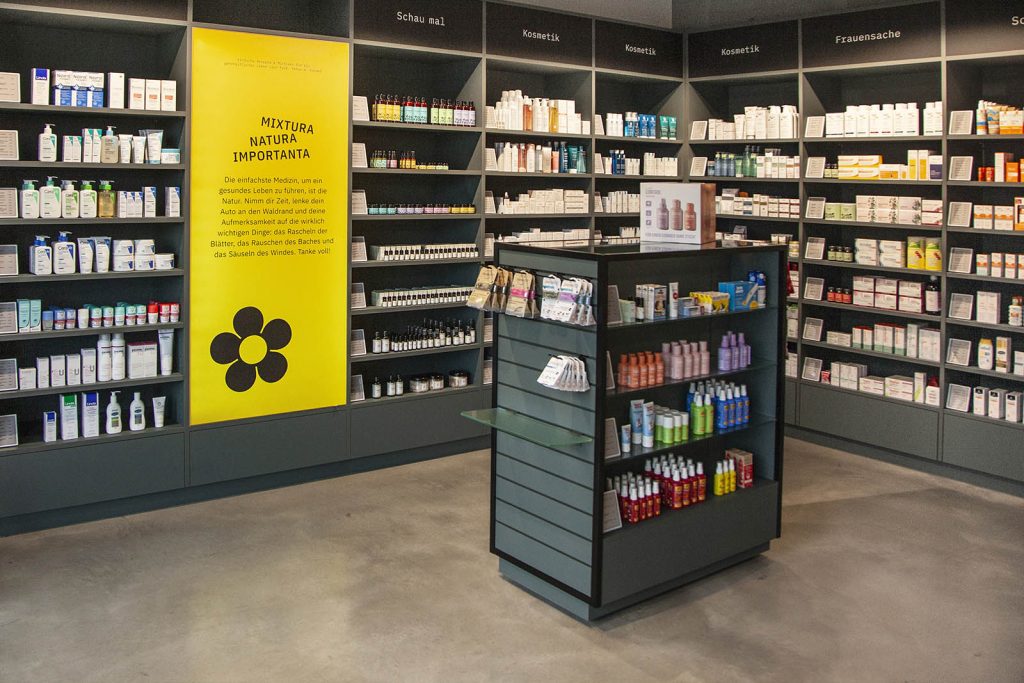
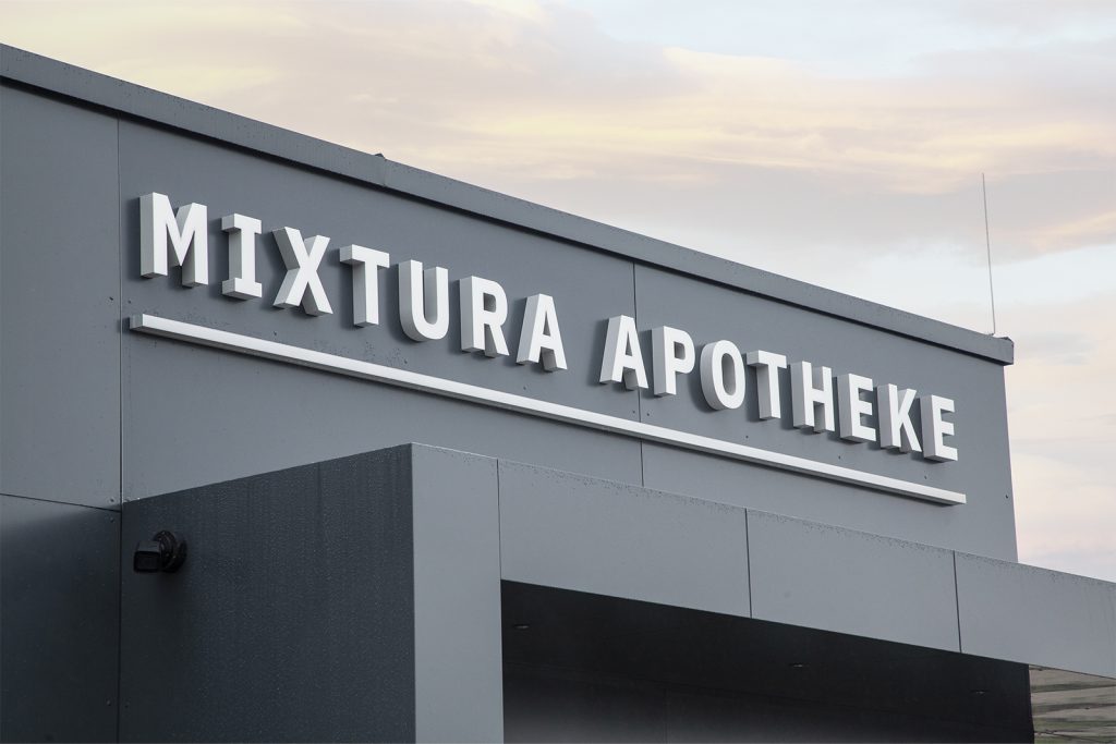
Take our new pharmacy client Mixtura, for instance, which is so named because we were able to create a corporate identity that blends black design with elegant typography. Or was it the other way round? Never mind. The result is a highly successful design identity that is memorable and stands out pleasantly amidst the garish, colourful chaos of the shopping centres in Vienna’s affluent suburbs.
Design & Concept: Alessandri Design