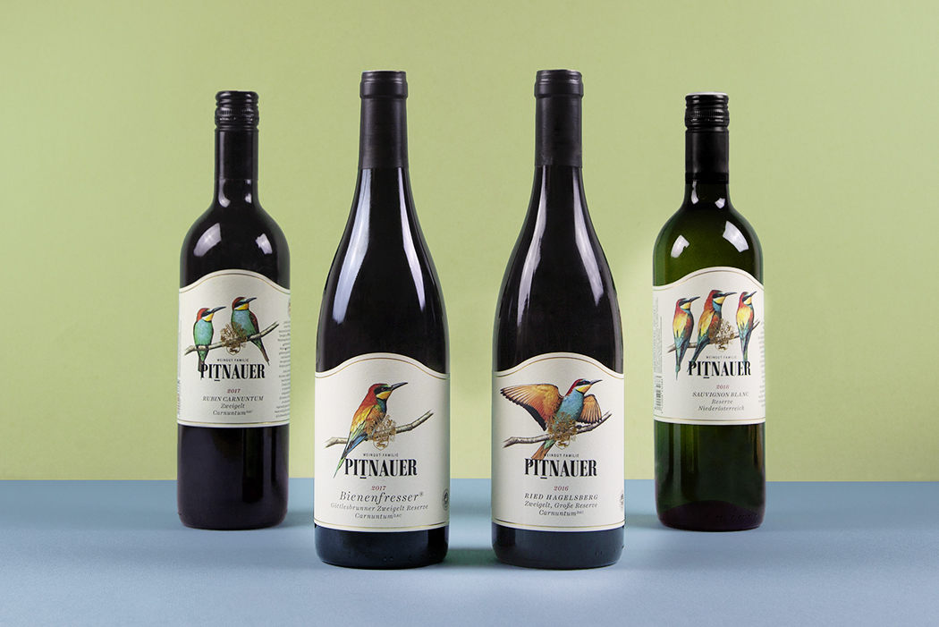
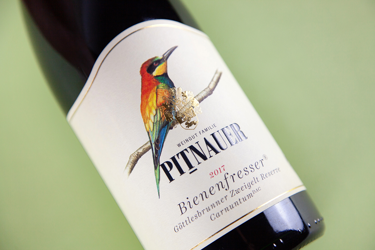
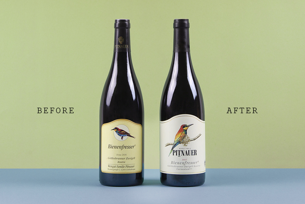
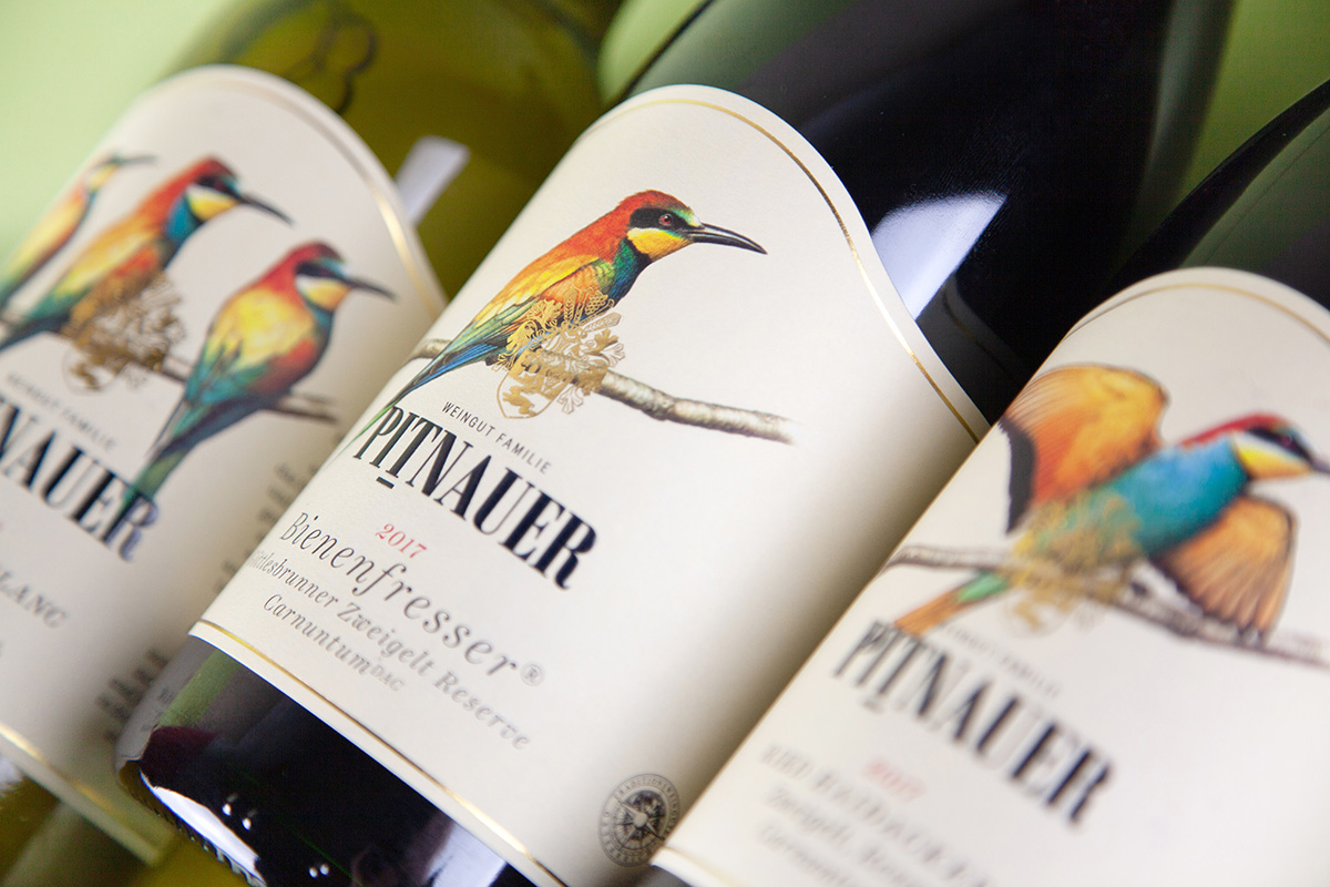
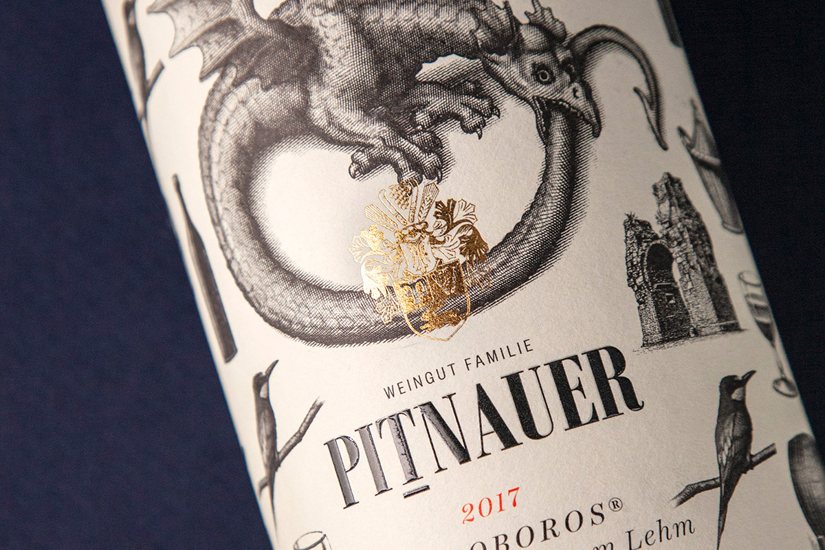
One thing that’s beyond any doubt is that the name Pitnauer has been a byword for some of the best wines to come out of the Carnuntum region since the start of the nineties. So it’s hardly surprising given all that quality that tons of different design elements– too many, in fact – built up over the decades.
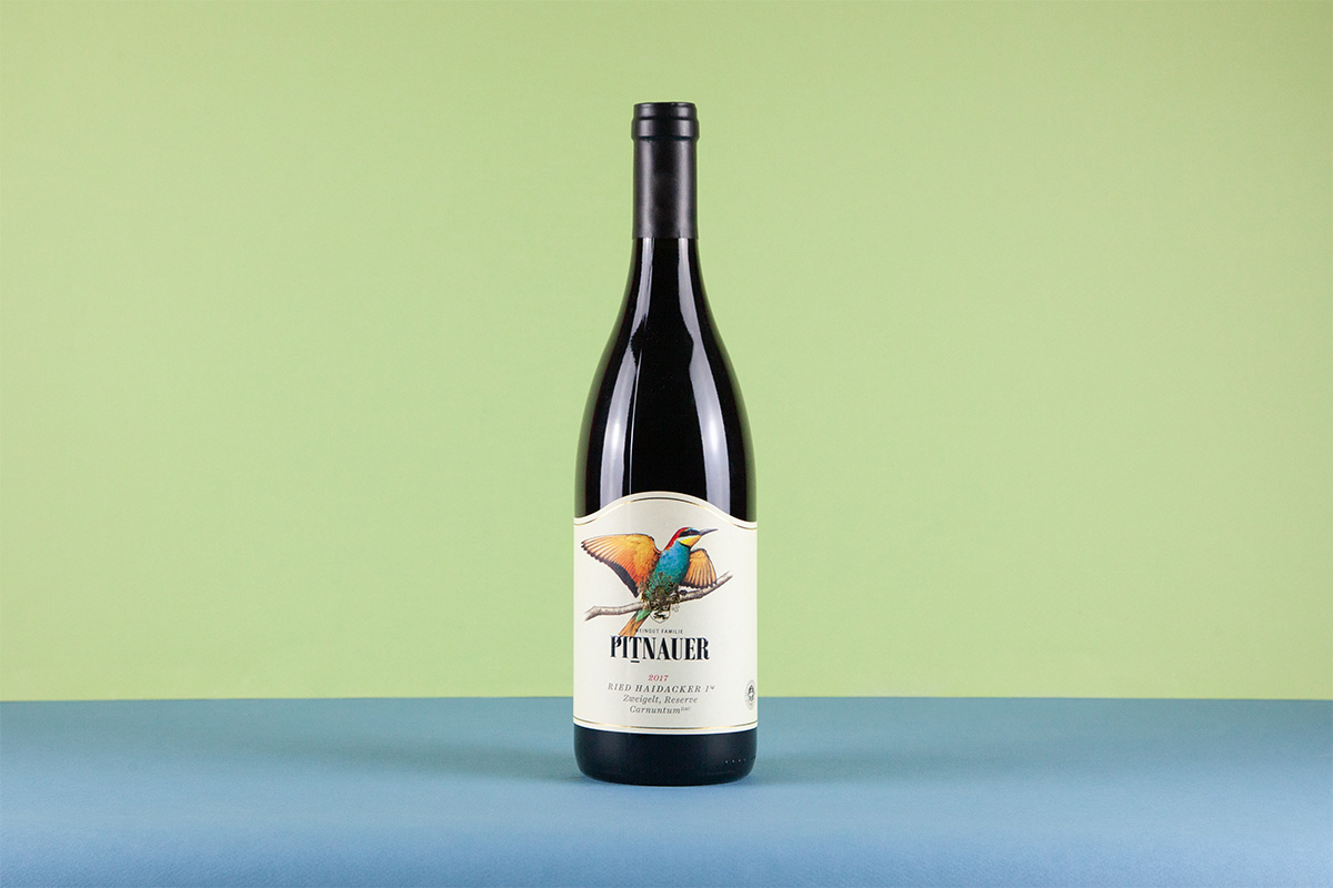
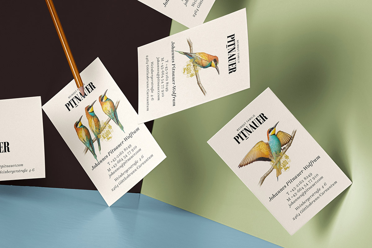
We had a bit of a clear-out and ended up concentrating on one specific icon: Merops apiaster, better known as the bee-eater and one of the rarest and most beautiful birds that live in the region. The birds were fleshed out a bit, while the eye-catching curves of the label were retained as a kind of trademark. Ultimately, the outcome was a kind of quality pyramid with one, two or three of the brightly-coloured little things. In short: all in all, a solid brand development that we are very proud of.